Real-time monitoring
Real-time Monitoring provides the following features:
-
Automatic collection, processing, and storage of metrics data, which refreshes every 20 seconds.
-
Intuitive diagrams that help you grasp data in multiple dimensions, such as line charts, heat maps, bubble charts, and ranking lists.
-
Data synchronization with Call Search and Data Insights, so that you can easily dive into problem analysis.
Getting started
To access the Real-time Monitoring page, do the following:
-
Subscribe to a pricing plan to enable the Real-time Monitoring feature for your project.
-
Log in to Agora Console and click Agora Analytics > Real-time Monitoring on the left navigation bar.
This section walks you through the Real-time Monitoring page and its basic features.
Global settings
All data on the page, except certain heat maps, refreshes every 20 seconds.
You can apply the following global settings to the page:
- Timezone: On the top of the page, select your timezone as Local or UTC.
- Project: In the upper-left corner of the left navigation bar, select a project.
- Product type: In the upper-right corner of the page, select Native or Web Video SDK from the dropdown menu.
- Auto update: In the upper-right corner of the page, uncheck the box for Auto Update to stop the data from automatic refreshing. Agora recommends you do this when investigating the metrics data at a specific moment. To resume automatic refreshing, check the box again.
Real-time scale
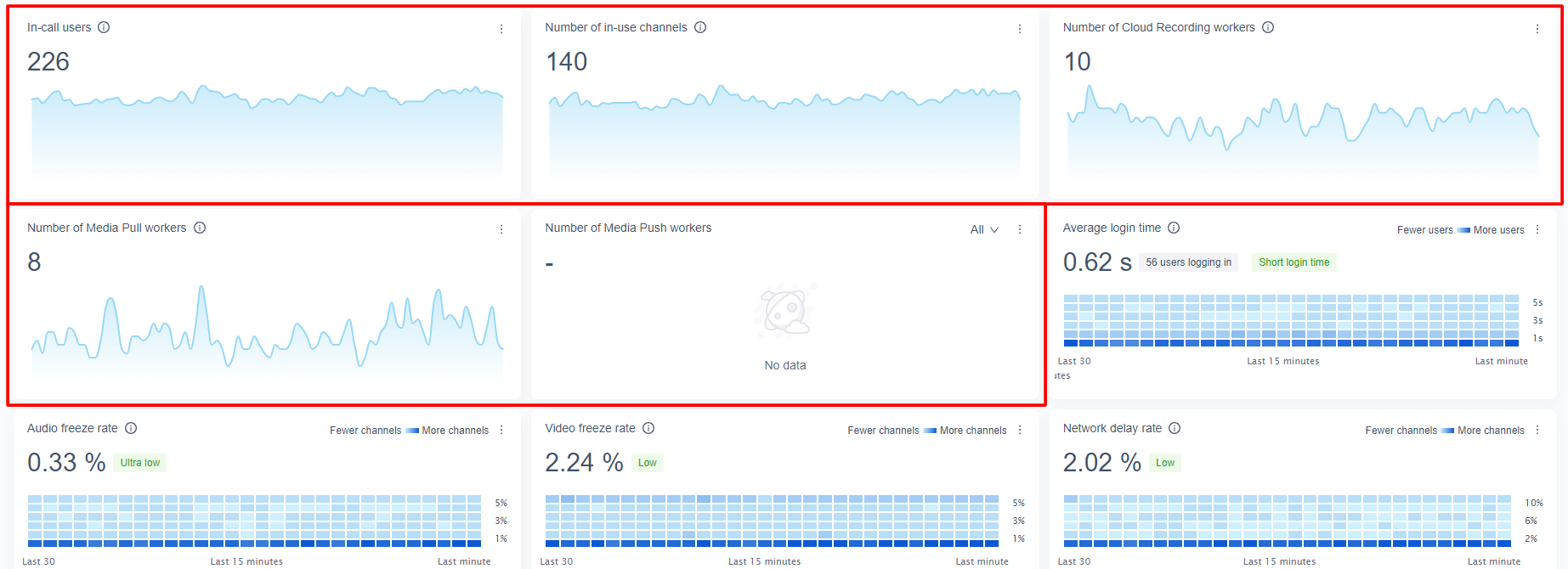
The following line charts display data for the last 30 minutes and refresh every 20 seconds:
- In-call users
- Number of in-call channels
- Number of Cloud Recording workers
- Number of Media Pull workers
- Number of Media Push workers
These metrics are explained in Scale metrics.
The latest value of each metric is displayed above the line chart, and refreshes every 20 seconds.
Each line chart refreshes every 20 seconds. To see the metric value at a specific moment, hover your mouse on a data point.
Real-time quality
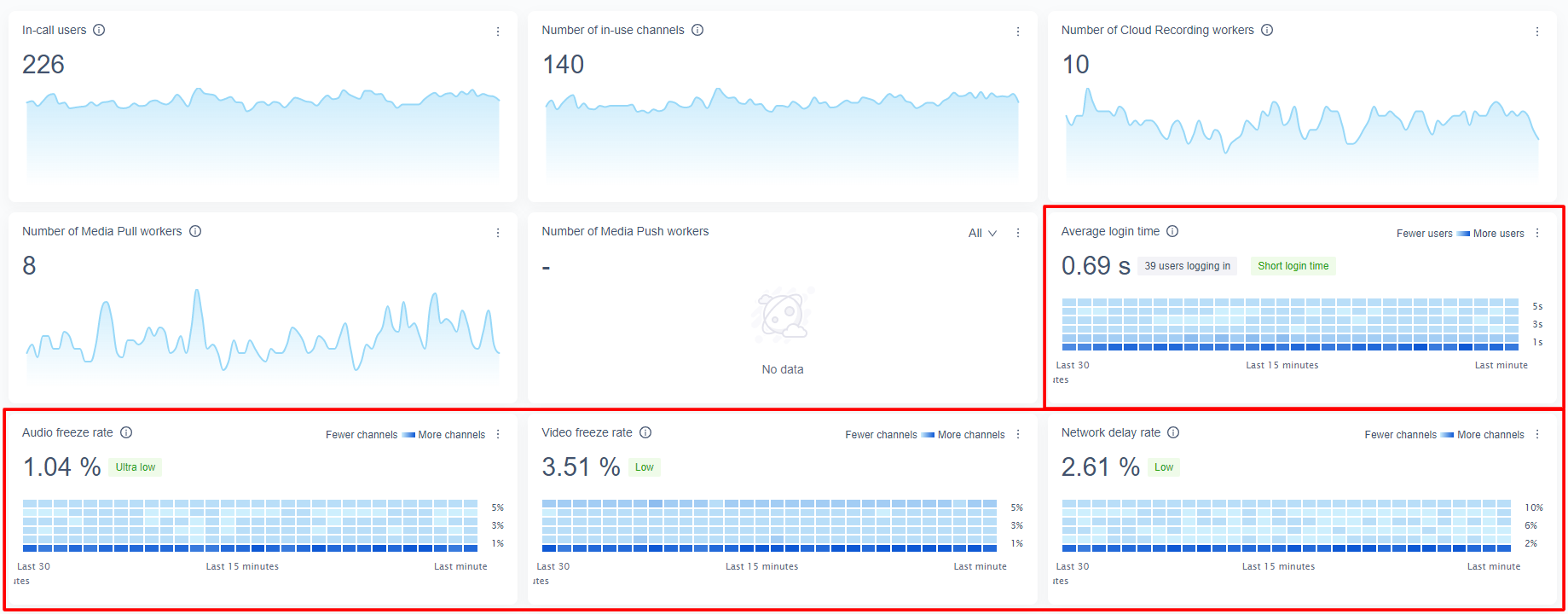
The heat map charts for Average login time, Audio freeze rate, Video freeze rate, and Network delay rate display data for the last 30 minutes. The four metrics are explained in Quality metrics.
The latest value of each metric is displayed above the heat map chart, and the tag next to the value shows the diagnosis result of the value. Both the value and the tag refresh every 20 seconds.
Each heat map chart refreshes every 60 seconds. The color of each cell represents the number of users or channels. The darker the color, the higher the number. To see the metric value at a specific moment, hover your mouse on a cell.
Additionally, the heat map charts provide the data sampling feature:
- Channel data sampling: On the chart for Audio Freeze Rate, Video Freeze Rate, or Network delay rate, click a data point to see its ranked channel list. The list is ranked in descending order of the metric value, and includes a maximum of 20 channels. To get more details about a channel, click Call Details to use Call Inspector.
- User data sampling: On the chart for Average login time, click a data point to see its ranked user list. The list is ranked in descending order of the metric value, and includes a maximum of 50 users. To get more details about a user, click Call Details to use Call Inspector.
Alert notification
If you have enabled the Alert Notification service, the Alert Notifications panel displays the latest three notifications.
In this panel, you can do the following:
-
Jump to Alert Notification: The upper-right corner shows the number of notifications in the last three hours. Click it to jump to the Alert Notification page.
-
Jump to Call Search: For each displayed alert notification, click Call Details to analyze the call using the Call Inspector service.
To enable and configure the Alert Notification service, see Alert Notification.
Region
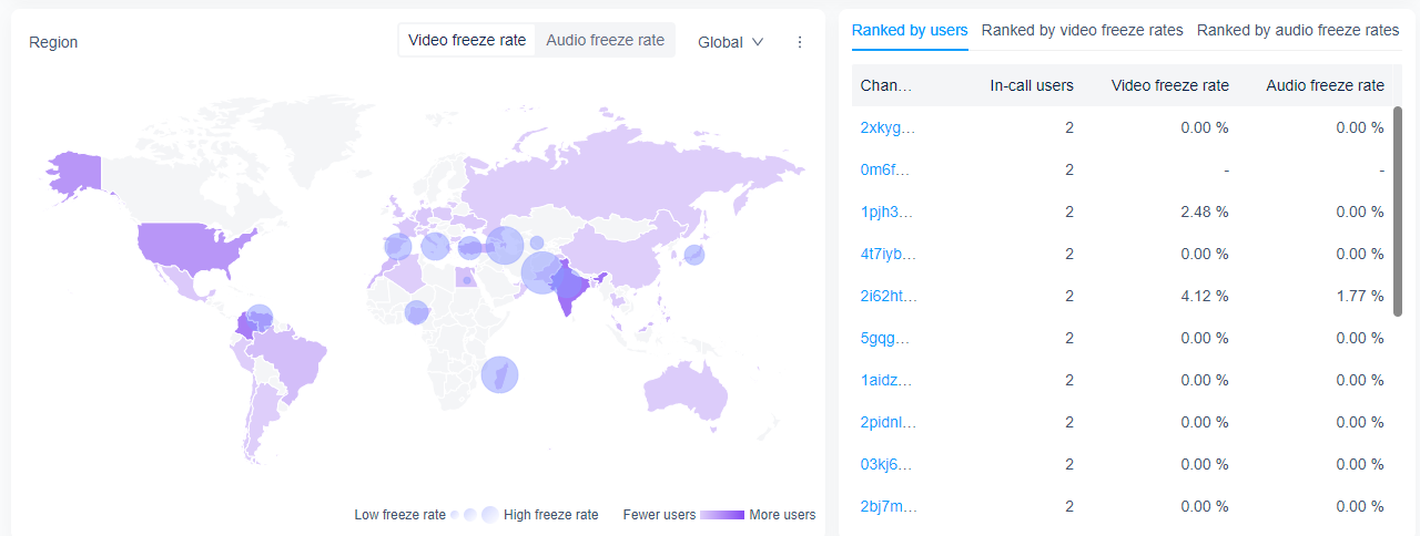
The Region heat map shows the geographical distribution of the video freeze rate and audio freeze rate. The color represents the number of users, and the bubble size represents the metric value.
You can refer to the following tips when navigating through the heat map:
-
Select a metric: In the upper-right corner, click to select Video Freeze Rate or Audio Freeze Rate.
-
Select a map: In the upper-right corner, choose World map, China map, or US map from the dropdown menu.
-
To see the metric value in a country or region, hover your mouse on the map.
-
Channel data sampling: Click a country or region or a bubble to see its ranked channel list. The list is ranked in descending order of the metric value, and includes a maximum of 20 channels. To further analyze a channel, click Call details to use Call Inspector.
Ranked channel lists
This panel includes the following ranked channel lists:
-
Ranked by users: The list of channels that have the most concurrent users.
-
Ranked by freeze rates: The lists of key channels that have relatively high video or audio freeze rates.
Multidimensional analysis
The bubble charts of Video Freeze Rate and Audio Freeze Rate show distributions of the two metrics from the perspectives of network type, SDK version, and device type.
In each bubble chart, the X coordinate is the number of concurrent users, and the Y coordinate is the metric value. The bubble color represents whether the metric value is normal. If the video freeze rate exceeds 5%, or the audio freeze rate exceeds 3%, the bubble turns red.
To see the specific data, hover your mouse on a bubble.
Key terms
Scale metrics
| Metric | Description |
|---|---|
| In-call users | The total number of users across all in-use channels. A user joining multiple channels is counted multiple times. |
| Number of in-use channels | The total number of in-use channels, as determined by uniquely named channels that contain users. |
| Number of Cloud Recording workers | See Cloud Recording. |
| Number of Media Pull workers | See Media Pull. |
| Number of Media Push workers | See Media Push. |
Quality metrics
| Metric | Description |
|---|---|
| Average login time | The average time it takes for a user to join a channel. |
| Audio freeze rate | Audio freeze rate is not included in the quality metrics of the Agora Video SDK for Web. That is, if you select Web Video SDK for product type in the global settings, the heat map chart for audio freeze rate does not display in the real-time scale panel. |
| Video freeze rate | The rate at which video freezing occurs, which equals Total video freezing time ÷ Total video duration. Native: Only video freezing longer than 600 milliseconds is counted. Web Video SDK: Only video freezing longer than 500 milliseconds is counted. |
| Network delay rate | The rate at which network delay occurs, which equals Total end-to-end network delay ÷ Total audio and video duration. Only end-to-end network delays longer than 400 milliseconds are counted. |
Both the audio duration and video duration in the table above are calculated by the number of streams.